Thursday, December 16, 2010

Painting the Kitchen.

The Fall 2010 semester is officially over, and I've finally picked a color for the kitchen.


Originally I was envisioning a deep teal, but decided on turquoise - Copper Patina by Benjamin Moore. It's actually the second sample I picked up, but I thought it was too bright at first. Seeing it next to the other colors I tried (five in total), though, it felt right.

We might end up tiling the back splash with white subway tile also during the winter break, but for now everything is getting painted.

Friday, September 24, 2010

Thinking More About Living Room Art.

Been super busy with school.

I've mentioned previously about possibly using rasterbator to make a huge print. I did a mock-run of a picture by Nivbed. We used the free printing at school to do a black and white version. The scale is nice. It needed more contrast in the original, because it's very Monet, even on the other side of the room, although you can still discern what the picture is of. Also, it doesn't lay perfectly flat. I taped all the pieces together, and it didn't fit completely perfectly together and there are some crazy undulations. So it would have to be glued to the wall, or to something else which would then hang on the wall. I don't know if I want to commit that much.

You probably would like to see a a picture of the rasterbator mock up, but since I think it's sad and pathetic, I'm not gonna.

So here are some other options I'm considering:

1) Large frames with large white mats, small art.

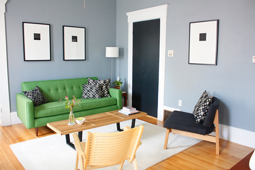
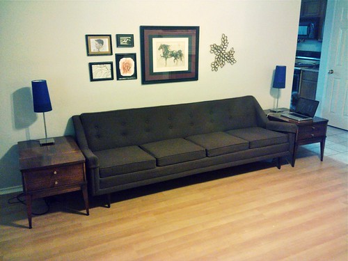
I like this option because it's simple, clean, and graphic. And you can find nice pieces of art that are small (i.e. cheap) but still make them have a big impact. I would do three frames above our couch, since it's so long and odd numbers look better.

2) Plates!

I really love the different graphic colors. It would probably make more sense in the dining room, but the kitchen is adjacent to the living room also, and hey, they are there for art rather than function. I don't have any graphic plates though. UO has some neat ones I'm always eyeing. I could probably get some of the awesome melamine ones from Target (which I have never picked up because Plastic plates + hot food = no bueno) also for fairly cheap, but the price would still add up for the number I would need. I'm too impatient to go scrounging flea markets and Etsy for the next several years to create a vintage collection.

So that's that. Probably gonna go with #1, whenever I feel like dropping $60+ on frames. That doesn't include finding the art and then getting custom mats. I can always do the plate wall on the blank wall of our mini hallway.

*images are borrowed from Apartment Therapy posts.*

Thursday, August 5, 2010

Art on the Living Room Wall.

So, this is a bigger peek at the living room: the wall with the couch. I moved the coffee table out of the way, because it always looks so awkward in photos.


I was tired of the tiny lamps we had been using (and the fact they did not match stylistically at all).

I wasn't able to find affordable vintage lamps, so we bought new lamps from IKEA. I like them. They are simple, modern, and cheap. I want to add more of the blue-violet, as well as teal, turquoise, and possibly lime, in the way of throw pillows and art and a floor rug.

The art was stuff we just had lying around. I would prefer to get a new mat for the horse print, in blue. But for now it's nice to just have something up on the wall. I'm sure I'll take it down at some point. I've been contemplating two picture rails, the length of the sofa, to set art on instead.

Friday, July 23, 2010

New Mirror.

Our living room gets an abysmal amount of natural light. I knew I wanted to put a mirror somewhere, but I wasn't quite sure where. Originally I was leaning towards putting a floor length mirror on the short wall next to the fireplace, but then I'd need to find a new home for the trunks that are there now. I asked my husband what he thought, and he preferred above the fireplace instead of next to it.


I found this mirror at IKEA. I would have preferred the silver if they made it in that size, but I do like the antique gold. I think it looks really nice with the vases from West Elm I picked up after cashing in some points from my credit card.

I'm really rather happy with it. The fireplace is not my favorite thing in the house, simply because it's so traditional and we have more of a vintage/modern aesthetic, but I'm hoping once I get everything into the room it will flow better. The living room is far from finished. I need to find some art to hang above the trunks, and over the couch, as well as a rug, and new table lamps. And eventually re-upholstering the armchairs.

Tuesday, July 13, 2010

The (previous) Master Bedroom.


I dug up the old photos from the online house tour when our house was for sale. As we complete more, I plan on posting the old pictures also. The old owner's style was much more contemporary/traditional while we are more vintage/modern.

We also discovered while painting the master that it was painted dark burgundy at some point. I am so glad they painted over it before we bought the house.

Friday, July 2, 2010

The Master Bedroom.

Hello. My husband and I bought our first house last July, and inherited some awesome vintage furniture from his side of the family back in March. It's not quite 'finished', but then, it never is.
Entrance to Master Bedroom